Customer Experience: An Interview with Jim Tincher (Part 2)
In part-one of our interview, Jim - founder of Heart of the Customer and Certified Customer Experience Professional (CCXP) - provides many great...

In our recent blog series, How to Measure Customer Experience During a Global Crisis, we talked about the importance of understanding your customers’ expectations, how you can roll out programs to meet them and continually evolve and adapt these programs over time.
Read the post: How to Measure Customer Experience During a Global Crisis
Given the importance of continuous measurement to the long term success of any CX program, we've collected our top 5 tips for helping CX and Operations leaders and practitioners keep up with the deluge of data. And at Intouch Insight we practice what we preach! You'll see all 5 reflected in the most recent update to our cx intelligence tool.
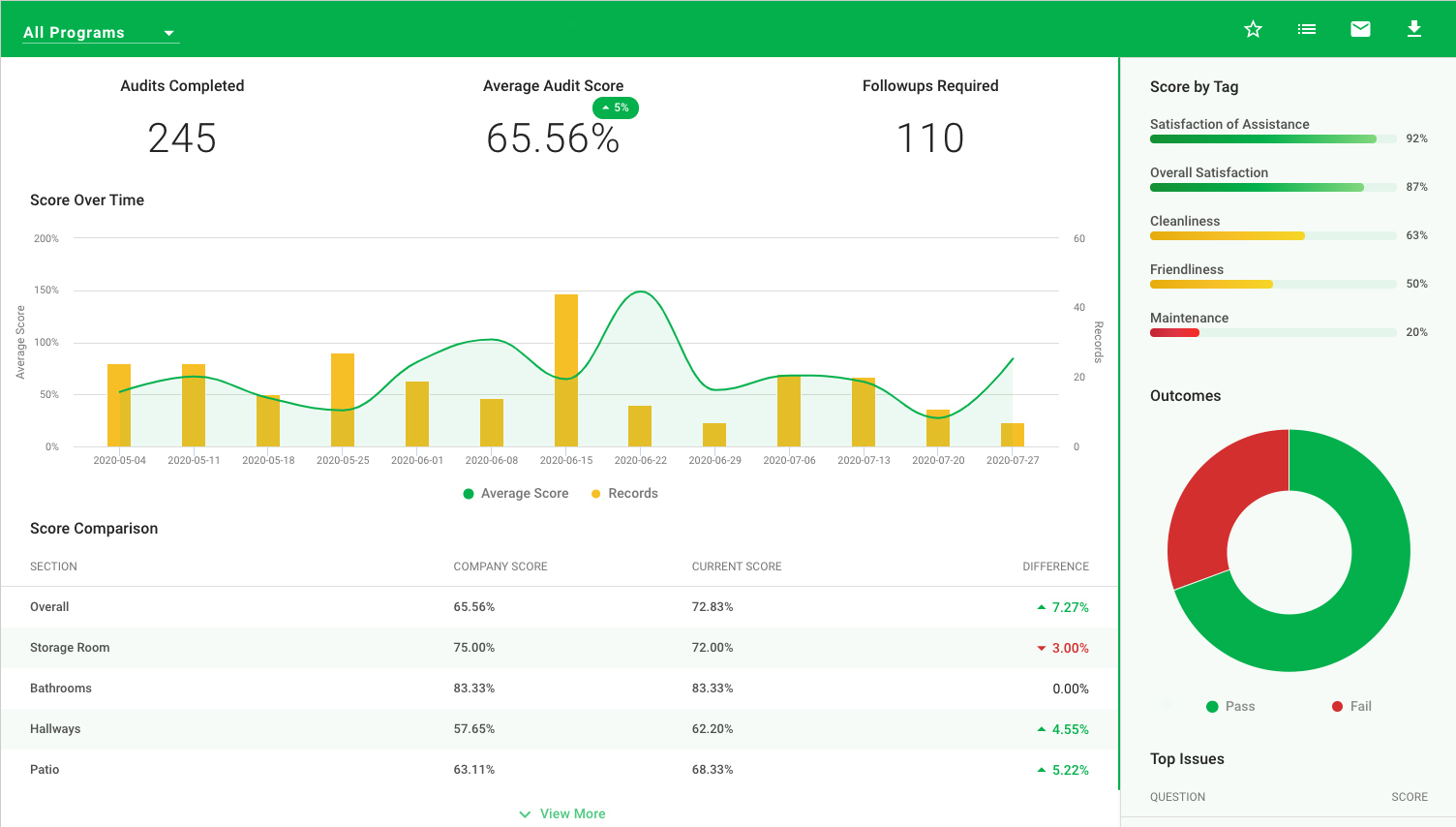
Data driven decisions are smart decisions, but with the volume of information that can be collected by a robust CX program it's important not to lose sight of your key metrics. Keep these top of mind by positioning them at the top of your dashboard!

*The latest update to the LiaCXTM Standard Dashboard introduces a new top bar highlighting the key metrics most relevant to the page
Recognizing a trend early is the key to developing a proactive CX program. This means it’s critical to track your program's performance over time. Keeping these types of reports front and centre will really help set your team up for success.

*The main, left side panel in new LiaCXTM Standard Dashboard will be home to detailed charts such those that track metrics over a date range.
That’s right, just like you were told to clean your room as a kid, we’re telling you to keep your dashboard tidy! Limiting the data available in your dashboard to just a snapshot allows you to quickly scan through what is available and then dig deeper only once you find what you’re looking for.
*Lists in new LiaCXTM Standard Dashboard will be limited to top 5 with the option to quickly expand when needed
As you work to declutter your dashboard, embrace the fact that some data is more easily digested as a visual rather than a list or table. Tracking data in your dashboard via a simple, visual chart can save your team valuable time.
*The right side panel in new LiaCXTM Standard Dashboard is home to visual charts such as pie charts and simple bar charts
The truth is that what works for one team or program won’t always suit another so it’s important to be flexible. We designed our standard dashboard to fit as many different programs as possible but with a diverse user base ranging across various industries we never shy away from building custom dashboards when needed.
As always, we want to know what you think! What are some things you’ve done to make your dashboard work best for your team? Reach out to us at letstalk@intouchinsight.com or head over to our Ideas Portal.

In part-one of our interview, Jim - founder of Heart of the Customer and Certified Customer Experience Professional (CCXP) - provides many great...

Last week, we attended Forrester’s 2018 CX NYC Forum. The two-day forum was filled with informative sessions held by Forrester’s customer experience...

We’ve just returned from a fantastic trip to New Orleans where we attended the 8th annual CXPA Insight Exchange, which was hosted at the Downtown...