Experiences that Matter - Volume II
At Intouch, we are incredibly proud of the amazing businesses that we get to call our clients. Early on in the pandemic, we wanted to do our part to...

Analysis paralysis can be a real problem. The more data you’ve collected the better informed your business decisions will be. But distilling raw numbers or drilling down to the right level to pull out actionable insights is challenging. That’s where our dashboard and reporting tools really make a difference.
Based on ongoing conversations with our partners, the Intouch Insight team has developed multiple ways to save you time trying to connect disjointed data or pull meaningful conclusions from across your business. Here, we’ll discuss three powerful dashboards that will enable you to do more with your data within the Intouch Insight Platform.
This is the closest thing you can have to a clairvoyant crystal ball. The performance trend dashboard is designed to help users track and analyze trends without a dedicated data analyst. These reports show users past and present data in order to predict and resolve potential issues before they become real problems or anticipate new opportunities to capitalize on your momentum.
The performance trend dashboard includes three ways to visualize your data.
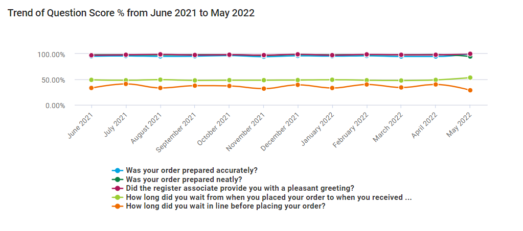
This chart type lets you see at a glance how multiple scores have changed month to month in relation to each other.
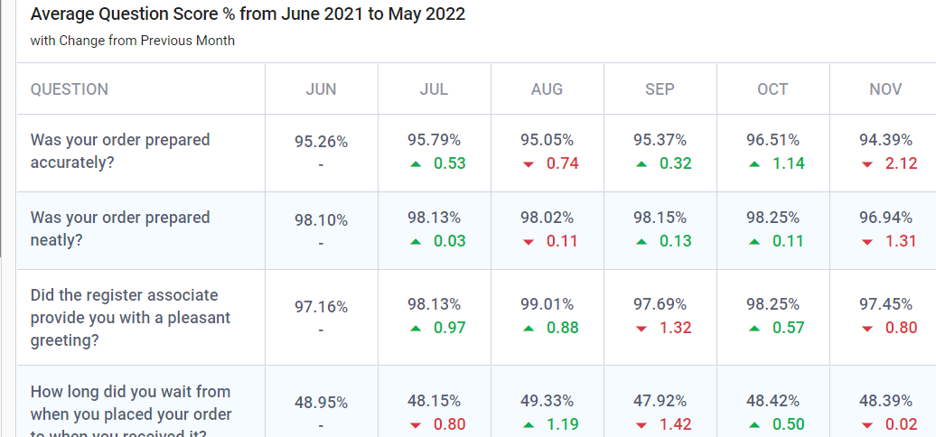
This chart type tracks selected scores over time and compares how they have increased or decreased from the previous month.
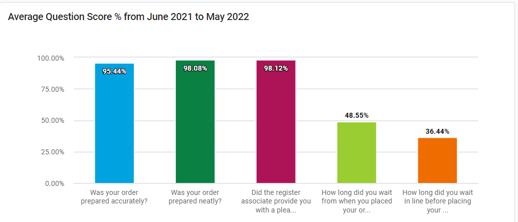
This chart type helps you quickly identify areas of your business that are not performing up to your standards by displaying the sum of data points during a selected time period.
Imagine you’ve launched a new initiative to improve the friendliness with which customers are greeted at your locations. The performance trends dashboard allows you to chart any or all mystery shopping or survey questions related to greetings and staff friendliness to track them over time.
Did they increase? By how much? Is it a sustained increase? Has the increase plateaued? All these questions can be answered using the performance trends dashboard.
This is like an answering machine, or voicemail for our younger readers, on steroids. The comments dashboard collects the answers from open ended questions across all your programs in one place. This means you can easily review what customers and staff are saying and, as long as you have sentiment analysis enabled for your questions, quickly narrow in on positive or negative comments in order to take action.
The comments dashboard includes two ways to visualize your data.
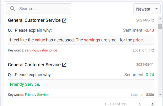
This displays all answers to the questions you’ve selected as well as the program name and sentiment score for each response so you can review each answer in its entirety.
Here you will see the total number of open ended response for the questions you’ve selected as well as a breakdown of responses per question to help you narrow down which questions to investigate in the list view
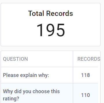
Perhaps you’ve noticed, via the performance trends dashboard discussed previously, that the cleanliness scores for your locations are dropping. Using the comments dashboard you can pull in all open-ended responses from customer surveys, mystery shopper visits, and internal audits related to cleanliness in order to dig into the cause.
Are there any common complaints? Is there a discrepancy between what is being reported across different programs? Have any comments requested specific action? By examining the comments, you can identify the route of the problem and develop an action plan accordingly.
Within the Intouch Insight Platform, a hierarchy is a structure that defines how your locations are organized. You can think of them like a folder directory - an individual location is within a district which is within a region etc. Each of these levels is a hierarchy node.
The hierarchy comparison dashboard allows users to compare data across these nodes so you can quickly see how different branches of your business are performing. This allows you to easily identify areas that are underperforming and need more attention as well as those that are leading the way and can be used as successful examples to replicate across other locations.
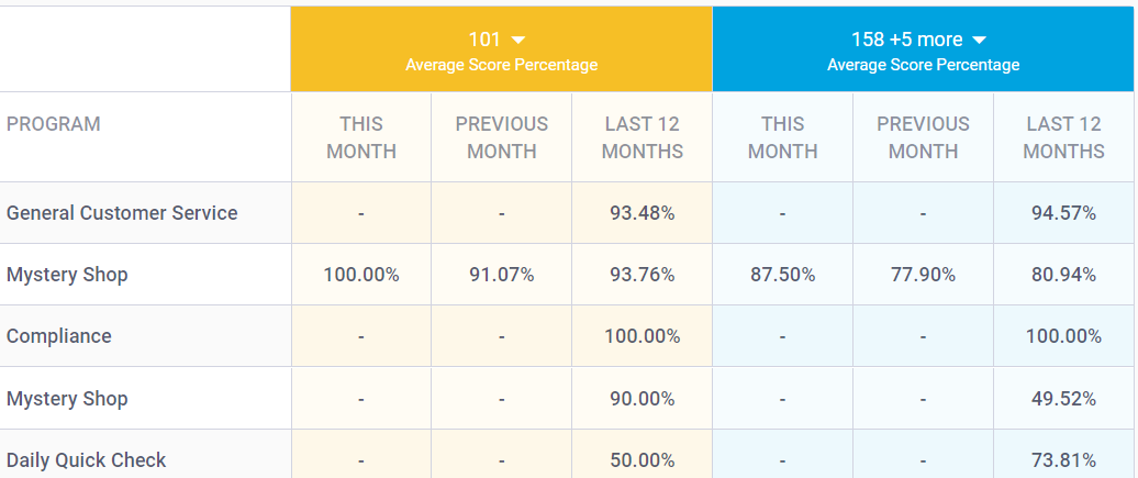
The hierarchy comparison dashboard includes two ways to visualize your data.
This chart type allows you view scores from a subset of a hierarchy across multiple time domains with your company benchmarks to see how they compare.
This chart type provides a graphical representation of how a subset of a hierarchy compares to company benchmarks within a specific time domain.
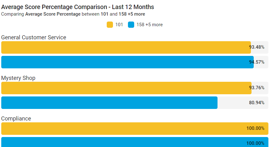
Ensuring brand standards are met across your entire business is an ongoing challenge for multi-location brands. Using the hierarchy comparison dashboard you can configure the chart of your choosing to highlight key metrics across your programs and then toggle between different hierarchy nodes to compare their results to your benchmarks.
Is one region consistently underperforming? Has a location exceeded expectations in a specific metric? By taking a bird’s eye view and examining different levels of your business you can better identify where your efforts can have the biggest impact.
Are you ready to unlock the true potential of your programs? Try one of the above dashboards and let us know how it goes! Run into trouble? Our team is ready to help at support@intouchinsight.com.
What other data visualizations would you like to see? We want to hear from you at letschat@intouchinsight.com.

At Intouch, we are incredibly proud of the amazing businesses that we get to call our clients. Early on in the pandemic, we wanted to do our part to...

Earlier this week, we conducted an interview with Jeanne Bliss, CEO/Founder of CustomerBliss, and Erin Fenn, Executive Vice President at Intouch...

With summer just around the corner and consumers focused on summer vacation plans, we know that businesses are looking ahead to the holiday season....